Typographic Experiment
California College of the Arts
Futurist Manifesto
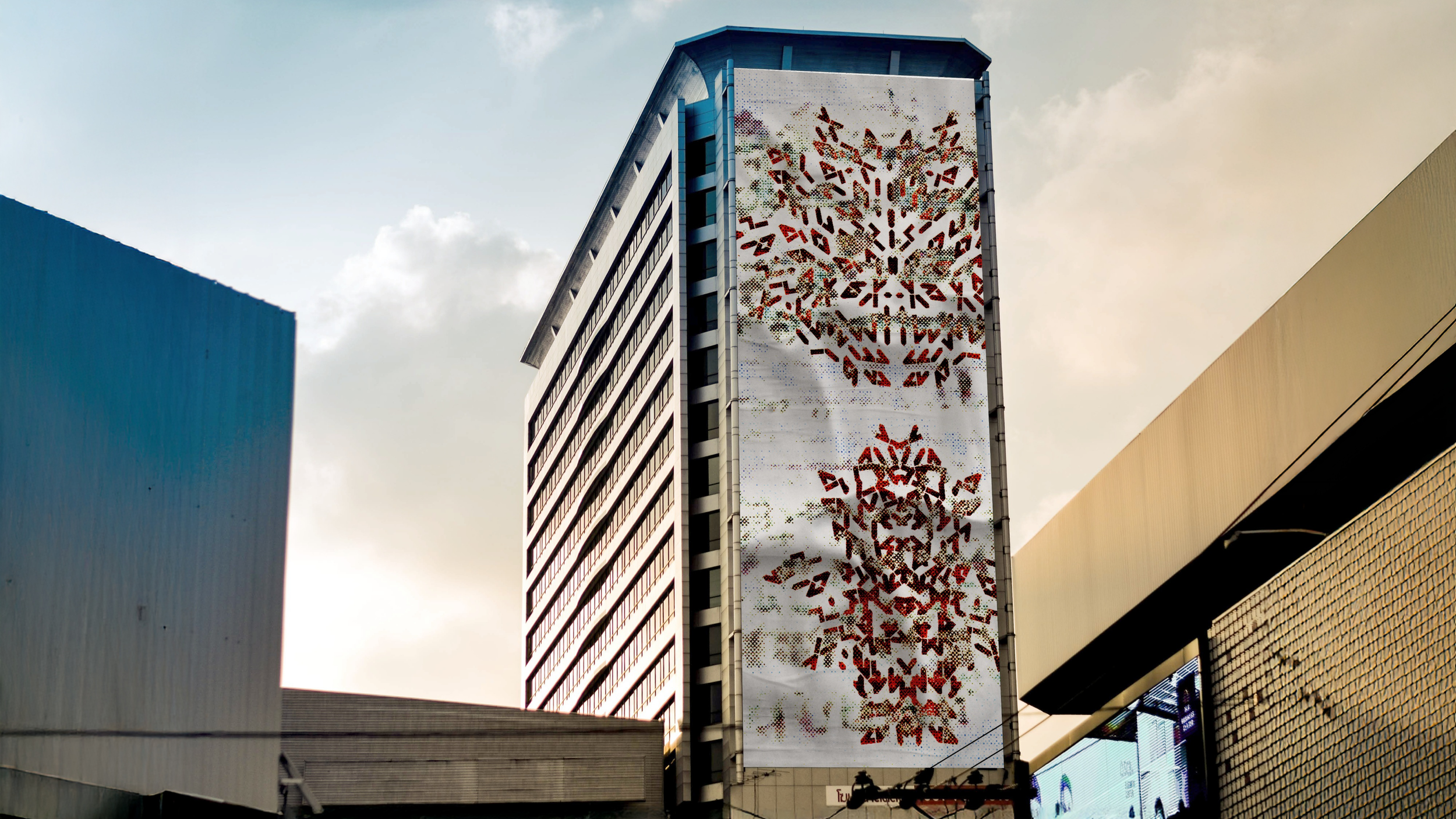
The Futurist Manifesto is hateful and crude, a product of its time, and as such the text is completely distorted to prevent anybody from reading F. T. Marinetti’s spiteful words, written to lash out at early 20th-century society. The entire manifesto was first typeset by hand in a near-illegible typeface, then cut apart and rearranged into the compositions featured on the posters. The backdrop of the posters features a version of the manifesto, digitally distorted beyond recognition through a myriad of digital processes. Both posters are printed on fabric to allow for organic distressing and artifacts to arise during the printing process. The juxtaposition of laying analog distortion over digital distortion, and then printing the result on fabric tries to stay true to Marinetti’s feelings while making sure they don’t radicalize anyone who might read them.
The motion piece features a series of different distortions of the manifesto, ending on a line from Beatrice Ward’s The Crystal Goblet, a ray of clarity that bursts through the chaos of the distorted manifesto. While The Crystal Goblet might serve as a sort of rational counterpart to the Manifesto, it is too conservative and reductionist in its advice to designers and typographers, asking them to eliminate all traces of their personality from the design process. As such, it is typeset in a loud, obnoxious face, in motion to draw all attention to it, presented as the flip side of the same coin as the Manifesto.

