Book Design
California College of the Arts
Kafka on the Shore
Chapter Book
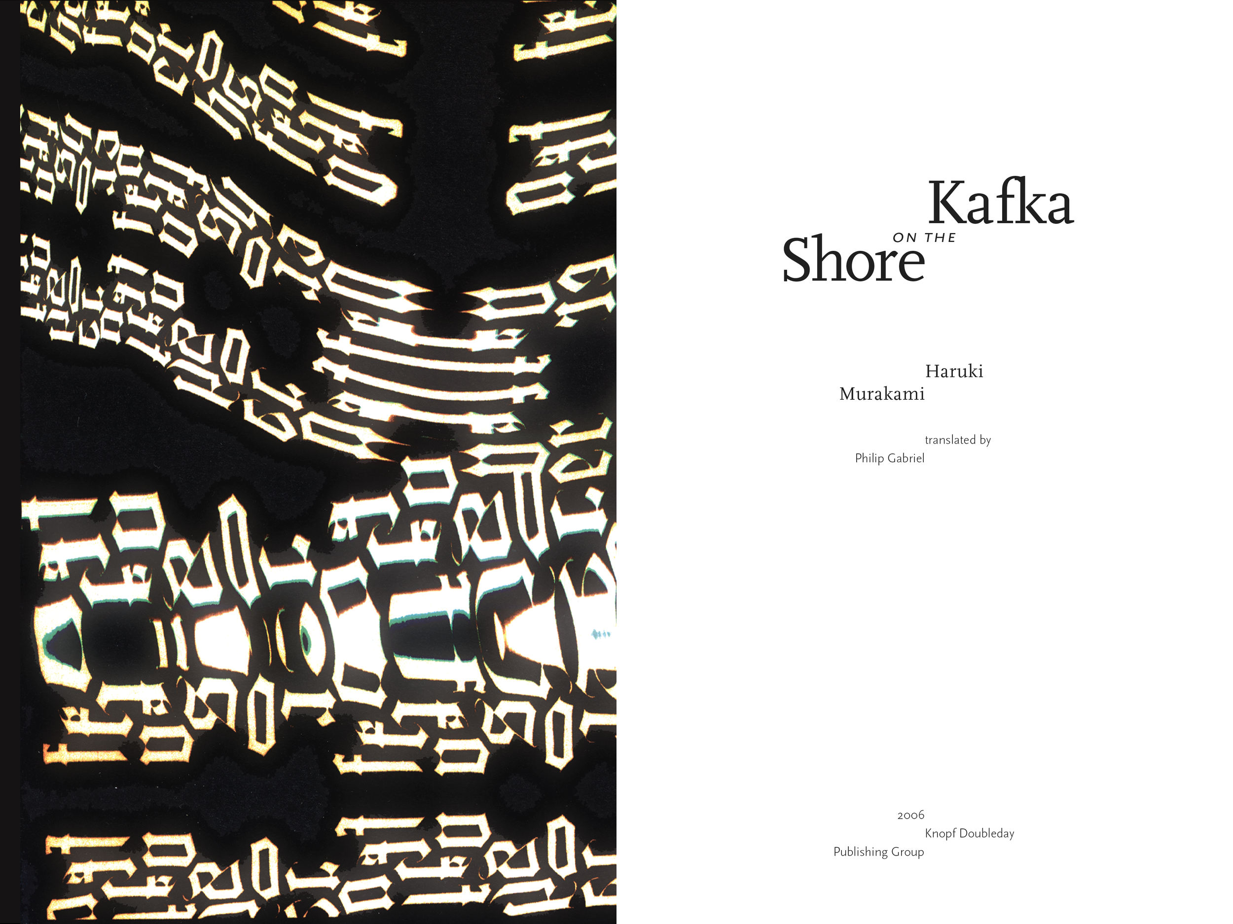
The front cover features the title of the book distorted twice; the first is a simulated error produced via scanning the title, which was typeset by hand, and the second is produced via projecting the first distortion on two surfaces. The hard edge that separates the part of the title that is in focus from the part that is blurred represents the border between the conscious and subconscious, dreaming worlds, the focal point of the story.
The inside front and back covers feature distorted type created via hand-setting type and distorting it in a method similar to the front cover. The two groups of distorted type are composed of abstract compositions built using the words “Kafka” and “Shore,” and represent a glistening sunset viewed from the titular shore. The edge from the front cover is echoed on the title page of the book.
The interior spreads of the book are set in the Scala font family, specifically Scala Pro and Scala Sans Pro. The chapters in the book alternate between subjective first-person accounts from the deuteragonists and an objective third-person account in the form of a declassified military document, and the change in the font indicates this subtle shift between perspectives.